
Colorful abstract art prints have transformed modern interior design, offering collectors and design enthusiasts an accessible way to bring bold, expressive artwork into their spaces. Unlike traditional representational art, abstract prints communicate through form, color, and composition, creating emotional resonance without depicting recognizable subjects. The vibrant palettes and geometric complexity found in contemporary abstract prints make them versatile statement pieces that can anchor a room's aesthetic or complement existing design elements. For those seeking to understand this dynamic art form, exploring its foundations, variations, and application potential reveals why these prints continue to captivate audiences worldwide.
Understanding Abstract Art Foundations
Abstract art emerged in the early twentieth century as artists began questioning the necessity of realistic representation. Pioneers like Wassily Kandinsky believed that color and form could convey spiritual and emotional truths without depicting the physical world. This revolutionary approach freed artists to explore pure visual elements, creating compositions that prioritized aesthetic experience over literal interpretation.
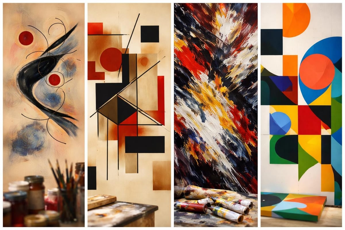
The evolution of abstract art encompasses numerous movements, from the geometric precision of Constructivism to the spontaneous energy of Abstract Expressionism. Each movement contributed distinct visual languages that continue to influence contemporary artists. Today's colorful abstract art prints draw from this rich heritage, combining historical techniques with modern sensibilities.
The Power of Color in Abstract Composition
Color functions as the primary communicator in abstract artwork, establishing mood, creating spatial relationships, and guiding viewer attention. Artists working with vibrant palettes understand how hue combinations generate specific psychological responses. Warm tones like yellows and pinks energize spaces and evoke optimism, while cool blues create calm, contemplative atmospheres.
Key color strategies in abstract prints include:
- Complementary contrasts that maximize visual impact through opposing hues
- Analogous harmonies that create cohesive, flowing compositions
- Triadic schemes balancing three equidistant colors for dynamic energy
- Monochromatic variations exploring depth within single color families
The chromatic architecture collection demonstrates how systematic color exploration creates structured yet vibrant compositions. Artists manipulate saturation, value, and intensity to build visual complexity within geometric frameworks.
Varieties of Colorful Abstract Art Prints
Contemporary abstract prints encompass diverse stylistic approaches, each offering unique aesthetic qualities. Understanding these variations helps collectors identify works that resonate with their personal taste and spatial requirements.
Geometric Abstraction
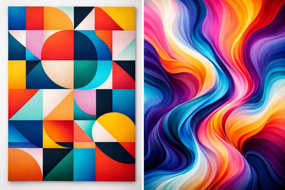
Geometric abstract prints emphasize structured forms, clean lines, and mathematical precision. This approach creates order through shapes like triangles, circles, squares, and polygons arranged in balanced or intentionally unbalanced compositions. The interplay between rigid geometry and vibrant color fields produces tension and harmony simultaneously.
Artists working in geometric abstraction often explore:
- Layered complexity through overlapping transparent forms
- Spatial ambiguity where shapes advance and recede
- Rhythmic repetition establishing visual patterns
- Counterpoint relationships between competing elements
The counterform concept particularly interests contemporary geometric artists, examining how negative space shapes positive elements and vice versa. This reciprocal relationship between form and void adds conceptual depth to visually striking prints.
Organic and Fluid Abstraction
Contrasting with geometric precision, organic abstraction embraces flowing curves, irregular shapes, and biomorphic forms. These prints often suggest natural phenomena like water movement, cellular structures, or botanical growth patterns without directly representing them. The color application tends toward gradients, blends, and soft transitions rather than hard-edged divisions.
| Geometric Abstraction | Organic Abstraction |
|---|---|
| Structured compositions | Flowing arrangements |
| Hard edges | Soft transitions |
| Mathematical precision | Intuitive placement |
| Angular forms | Curved shapes |
| Controlled color blocks | Blended gradients |
Both approaches produce compelling colorful abstract art prints, and many contemporary artists blend elements from each tradition to create hybrid styles.
Selecting Abstract Prints for Your Space
Choosing the right abstract print requires considering multiple factors beyond personal aesthetic preference. The relationship between artwork, architecture, and existing design elements determines how successfully a piece integrates into your environment.
Scale and Proportion Considerations
Print size dramatically affects visual impact and spatial perception. Oversized prints command attention and can make small rooms feel larger by drawing the eye upward and outward. Conversely, modestly sized works suit intimate spaces or gallery wall arrangements where multiple pieces create cumulative impact.
Practical sizing guidelines:
- Small spaces (under 100 sq ft): 16x20 to 24x36 inches
- Medium rooms (100-250 sq ft): 30x40 to 40x60 inches
- Large areas (250+ sq ft): 48x72 inches and larger
- Vertical spaces: Consider proportions matching wall dimensions
Choosing abstract art for your space involves measuring wall dimensions, considering viewing distances, and evaluating how the print's proportions complement your room's architecture.
Color Coordination Strategies
While colorful abstract art prints shouldn't merely match existing decor, thoughtful color relationships create cohesive environments. Successful integration balances harmony with contrast, allowing the artwork to enhance rather than clash with surrounding elements.
Three effective coordination approaches include:
- Accent extraction: Select prints featuring one or two colors present in furnishings or accessories
- Complementary tension: Choose colors opposite those dominating the space for energizing contrast
- Neutral foundation: Place vibrant prints against neutral backgrounds for maximum impact
Contemporary collectors increasingly embrace bold choices that challenge conventional matching rules. A print with unexpected color combinations can revitalize a stale palette, introducing fresh energy and visual interest.
Production Quality and Material Considerations
The technical aspects of print production significantly affect longevity, color accuracy, and overall presentation. Understanding these factors ensures informed purchasing decisions that deliver lasting value.
Printing Technologies
Modern reproduction methods offer varying benefits suited to different applications and budgets. Giclée printing using archival inks on museum-quality paper or canvas represents the gold standard for fine art reproduction. This process delivers exceptional color fidelity, tonal range, and permanence.
Comparison of common printing methods:
| Method | Color Accuracy | Longevity | Best For |
|---|---|---|---|
| Giclée | Excellent | 100+ years | Limited editions |
| Offset lithography | Very good | 50+ years | Larger runs |
| Digital inkjet | Good | 25-50 years | Affordable options |
| Screen printing | Variable | 75+ years | Graphic styles |
When evaluating colorful abstract art prints, inquire about ink types, paper specifications, and archival ratings. Pigment-based inks on acid-free substrates ensure colors remain vibrant for decades.
Paper and Canvas Substrates
Substrate choice influences texture, appearance, and display options. Fine art papers range from smooth hot-press surfaces ideal for detailed geometric work to textured cold-press varieties that add tactile dimension. Cotton rag papers offer superior archival properties compared to wood-pulp alternatives.
Canvas prints provide different aesthetic qualities, particularly suited to larger formats. The woven texture adds subtle dimensionality, while stretching over frames creates gallery-wrapped presentations. For those exploring original artwork versus prints, understanding substrate differences clarifies each option's unique characteristics.
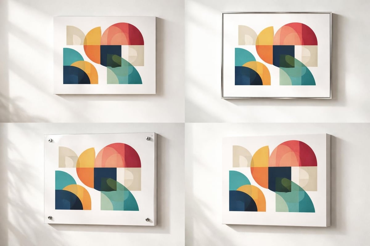
Framing and Presentation Options
Proper framing protects prints while enhancing their visual impact. The frame serves as a transitional element between artwork and environment, either reinforcing the piece's aesthetic or providing deliberate contrast.
Contemporary Framing Approaches
Minimalist frames with clean lines suit geometric abstractions, avoiding competition with the artwork's inherent complexity. Simple black, white, or natural wood frames maintain focus on color and form. Float mounting creates shadow gaps between print and matting, adding sophisticated depth.
For maximum contemporary impact, consider these presentation methods:
- Frameless acrylic mounting for sleek, gallery-style display
- Metal frames with narrow profiles for industrial aesthetics
- Deep-set frames creating shadow boxes for dimensional presence
- Museum glass eliminating reflections and UV damage
The framing decisions you make should complement both the artwork and your interior architecture, creating unified visual experiences.
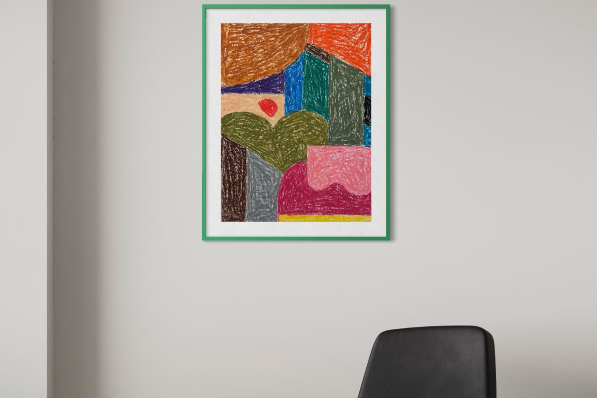
Matting Strategies
Matting provides breathing room between image and frame while offering color coordination opportunities. Standard white or cream mats suit most colorful abstract art prints, creating neutral transitions that don't compete with vibrant palettes. Custom-colored mats can echo specific hues within the composition, though this approach requires careful execution to avoid overwhelming the artwork.
Double matting adds subtle sophistication, revealing a thin inner border in a contrasting color. This technique works particularly well with prints featuring complex color interactions, as the layered matting mirrors the artwork's dimensional quality.
Building Cohesive Collections
Collecting multiple colorful abstract art prints allows for creative arrangements that amplify individual pieces' impact. Whether creating gallery walls, triptychs, or distributed placements throughout a space, thoughtful curation produces dynamic results.
Gallery Wall Composition
Successful gallery walls balance variety with unity, combining different sizes, orientations, and compositions while maintaining visual coherence. Color provides the connecting thread, with each print contributing to an overall chromatic scheme.
Strategic gallery wall planning involves:
- Arranging prints on the floor before hanging
- Maintaining consistent spacing (typically 2-3 inches between frames)
- Establishing a central axis or focal point
- Mixing orientations for visual interest
- Considering sightlines from multiple room positions
The chromatic study series exemplifies how related works with unified color approaches create compelling serial presentations. The Chromatic Study explores balance and tension through layered geometry with vibrant palettes spanning yellows, blues, pinks, and intermediate hues, offering collectors versatile options for single or grouped displays.
Series and Themed Collections
Many artists develop bodies of work exploring specific concepts, color relationships, or formal investigations. Collecting from these series ensures aesthetic continuity while supporting deeper engagement with artistic intent. Themed collections might focus on particular color families, geometric approaches, or compositional strategies.
Building collections over time allows spaces to evolve alongside changing tastes and life circumstances. Starting with foundational pieces and gradually adding complementary works creates living environments that reflect personal growth and developing aesthetic sophistication.
Care and Preservation Guidelines
Protecting your investment ensures colorful abstract art prints maintain their visual impact for generations. Simple preventive measures dramatically extend print longevity while preserving color vibrancy.
Environmental Factors
Light exposure represents the primary threat to print longevity, particularly ultraviolet radiation that degrades pigments and substrates. Position prints away from direct sunlight, or utilize UV-filtering glazing for unavoidable bright locations. LED lighting provides safer illumination than incandescent or fluorescent alternatives.
Essential preservation practices include:
- Maintaining stable humidity levels (40-50% relative humidity)
- Avoiding temperature extremes and rapid fluctuations
- Preventing contact with acidic materials
- Using archival mounting and backing materials
- Keeping prints away from kitchen moisture and cooking residue
Regular gentle dusting with soft brushes prevents particle accumulation. For framed works, ensure backing materials seal out environmental contaminants while allowing minimal air circulation to prevent moisture trapping.
Long-Term Storage
Unframed prints require careful storage to prevent creasing, tearing, or chemical damage. Acid-free tissue interleaving protects surfaces, while archival boxes or portfolios provide structural support. Store prints flat rather than rolled when possible, as rolling can stress paper fibers and create permanent curves.
Climate-controlled environments preserve print quality during extended storage periods. Avoid basements prone to humidity fluctuations or attics experiencing temperature extremes. Periodic inspection catches developing issues before they become irreversible.
Investment Value and Artist Relationships
While many collectors acquire colorful abstract art prints purely for aesthetic enjoyment, understanding market dynamics and artist practices enriches the collecting experience. Limited editions, artist signatures, and certificates of authenticity affect both current value and appreciation potential.
Edition Types and Numbering
Limited edition prints carry greater collectibility than open editions due to controlled availability. Edition sizes typically range from 10 to 500 prints, with smaller editions commanding higher prices. Artist's proofs (AP) and printer's proofs (PP) exist outside the numbered edition, often retained by creators or collaborators.
Edition information appears as fractions (e.g., 15/100) indicating the specific print number and total edition size. Lower numbers don't necessarily increase value, though first prints occasionally show subtle quality differences. What matters most is edition legitimacy verified through proper documentation.
Supporting Living Artists
Purchasing directly from contemporary artists or their authorized representatives ensures authenticity while supporting creative practices. Many artists offer commission opportunities for collectors seeking unique works tailored to specific spaces or color preferences. The commission process allows collaborative creation, resulting in truly personalized abstract compositions.
Building relationships with artists provides insights into their creative processes, thematic explorations, and future directions. This connection transforms collecting from mere acquisition into meaningful cultural participation, supporting the ongoing evolution of abstract art.
Trends Shaping Contemporary Abstract Prints
The abstract art landscape continuously evolves as artists respond to cultural shifts, technological innovations, and aesthetic movements. Understanding current trends helps collectors identify emerging voices while appreciating how colorful abstract art prints reflect contemporary visual culture.
Digital Tools and Hybrid Practices
Many contemporary artists integrate digital design tools with traditional media, creating works that begin as physical paintings or drawings before digital refinement. This hybrid approach expands creative possibilities while maintaining the tactile authenticity collectors value. The resulting prints often exhibit precision difficult to achieve through purely analog methods.
Conversely, some artists deliberately emphasize handmade qualities as counterpoints to digital ubiquity. Visible brushwork, imperfect edges, and material textures assert physicality in an increasingly virtual world. Both approaches produce compelling colorful abstract art prints suited to different aesthetic preferences.
Maximalist Color and Pattern
Recent years have witnessed renewed embrace of bold, saturated palettes after decades of minimalist neutrality. Contemporary collectors increasingly seek prints featuring fearless color combinations and complex pattern interactions. This maximalist tendency reflects broader cultural shifts toward expressive individuality and rejection of restrained conformity.
Geometric abstractions particularly benefit from this trend, as structured compositions provide frameworks for chromatic intensity. The interplay between organizational geometry and uninhibited color creates dynamic tension that energizes contemporary interiors.
Colorful abstract art prints offer versatile, impactful ways to transform living and working environments through bold composition and vibrant chromatic exploration. Understanding quality factors, presentation options, and collection strategies empowers informed decisions that deliver lasting aesthetic satisfaction. Whether you're drawn to precise geometric compositions or fluid organic forms, Nathalie Chikhi creates original artworks and prints exploring chromatic architecture, counterform, and layered complexity with signatures palettes spanning the full color spectrum. Discover how these distinctive pieces can elevate your space with artistic energy and visual sophistication.
